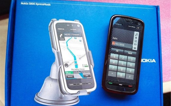
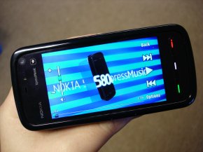
 Please bear in mind that these impressions, observations and pictures come from pre-release hardware and software. As such they may be subject to change, we will have to wait for production hardware and software before drawing any final conclusions.
Introduction
Announced at Nokia's Remix event in London, at the beginning of October, the Nokia 5800 XpressMusic is a mid-range, music focused phone, running S60 5th Edition on Symbian OS 9.4, with a 3.2 megapixel camera, integrated GPS, WiFi and HSDPA connectivity, and a 3.2 inch touch screen. It's the last item on this feature list which draws attention to what would otherwise be a fairly standard mid range phone.
For the Nokia 5800 XpressMusic is one of Nokia's most widely talked about (and leaked) phones of recent memory. There's no doubt that it is going to garner attention, coming in the wake of the recent spate of touch phones, including, of course, the Apple iPhone. While it's not Nokia's first touch phone (Nokia 7700/7110) or its first recent touch device (Nokia N810), it is the first S60 touch enabled phone and is a significant landmark in Nokia's mobile device story. However, it is worth noting from the start that it is not "Nokia's touch phone", instead it is the first in a portfolio of touch enabled phones from Nokia. This is an important distinction because, while the 5800 can tell us much about Nokia's touch platform generally, it can only be fairly assessed in the context of its own market positioning (music focused, cost of 279 Euro before taxes and subsidies).
 General Design and Hardware
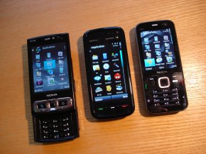
The 5800, at 111 x 51.7 x 15.5 mm, is a reasonably small package. It is similar in size to the N78 (113 x 49 x 15.1 mm), but slightly heavier at 109g versus 102g. Volume wise, the 5800 is bigger at 83 cc compared to the N78 at 76.5 cc; it does feel bigger in the hand, mainly due to the greater taper on its edges. While the 5800 is significantly bigger than the typical mid-range phone and would do well to be thinner, it compares favourably to other smartphones and does not feel over sized.
Thanks to its relatively narrow width it is, proportionally, closer to the traditional candy bar shape (long rectangle) than most touch screen based phones (short rectangle). If you think of your typical candybar smartphone, remove the keypad and lengthen the screen and you'll get pretty close to the feel of the 5800. The key advantage of this shape is that, for most people, it will be possible to use the device with just one hand; even those with smaller fingers should be able to reach all points on the screen.
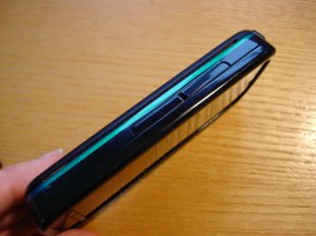
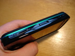
The overall design of the device, screen apart, is in line with typical mid range candy bar phones from Nokia. The materials are dominated by light plastics, chiefly black, but with a coloured highlight running around the sides of the phone. Build quality is good, with no rattles or unwelcome squeaks, and it should have good long term durability. It certainly gives the feeling of being able to stand up to quite a lot of abuse.
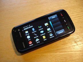 The front of the device is dominated by the 3.2 inch resistive touch screen, which has a resolution of 360 x 640 pixels (Nokia refer to this as nHD). This is much higher than most previous S60 devices (QVGA: 240 x 320) and has a wider aspect ratio (16:9 compared to 4:3). Touchscreens typically use resistive or capacitive technology; capacitive touchscreens (as used on the iPhone) are generally regarded as more sensitive and work better in sunlight, but only work with finger touch, whereas resistive touchscreens can work with any object (finger, stylus, when wearing gloves etc.). The 5800's screen is set behind the resistive layer and is therefore well protected.
Resistive touchscreens work by having two thin layers of conductive and resistive material which detect a 'touch' when they are pressed together; this means a physical push is required for a touch to be registered. The main concern with such screens, from a usability viewpoint, is how much of push is needed. If you're using the stylus (easily the most accurate way to interact with any touchscreen) with the 5800 then there are no problems at all. Even with the less accurate/controllable finger touch, I was pleasantly surprised about the performance; I've only had one or two instances where a touch did not register. That's extremely good compared to other resitive touch screens I have used. Incidentally, the pre-production model I've been using is much improved over some of the models that were being used for demos at the launch.
The other typical problem with such touch screens is that the resistive layer can dull screen clarity and brightness; but again this isn't an issue with the 5800. Indeed I think the 5800's screen is one of the device's high points; Nokia were quite serious when said it was industry leading at the launch event. Colour range and accuracy is excellent for an LCD based screen and its high resolution gives it impressive detail and sharpness. Outdoor performance, in bright sunshine, is OK, although it doesn't quite measure up to the N95 8GB's transflective screen or the iPhone's capacitive touch screen in terms of visibility.
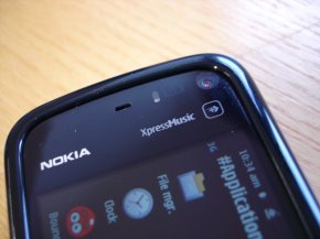
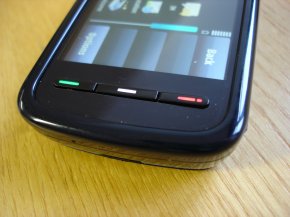
At the bottom of the screen there are three keys: a send key (green), a home key and an end key (red). The home key (the equivalent of the swirly S60 key) switches between the home screen and the application screen (or with a long press pops up the multi-tasking switcher). The inclusion of the send and end keys is a sensible addition - it allows you to quickly answer or end phone calls without looking at the screen, and, as with other S60 phones, they can also used for shortcuts in numerous places (e.g. activating the call log from the home screen, initiate calls in contacts and so on). At the top of the screen, next to the usual VGA video calling camera, is a proximity sensor which locks the screen (deactivates touch) when you hold the phone to your ear, which should prevent your cheek inadvertently ending calls or sending naughty text messages.
